 AERELONTECH
tech
Visual communication

Tricks to use in your next slide deck swaying executive decisions like a pro. This time I talk about:
- chevrons and to represent dimensions for easy comparision,
- strategy temple used by all management consultants,
- portfolio view that elevates your executive presence,
- objectives and status to focus only on the decisions that matters,
- how to bring deeply technical topic to execs like infrastructure decisions,
- basic visual eye-candies, like graphs, icons, even font sizing matters throughout your document.
Incredibly fast and effective communication for executives
With downloadable example slides you can use right now!
Let's dive right in.
Chevrons and dimensions
Matching the visuals to the message is key to become a clear communicator, be it presentation or any other digital formats.
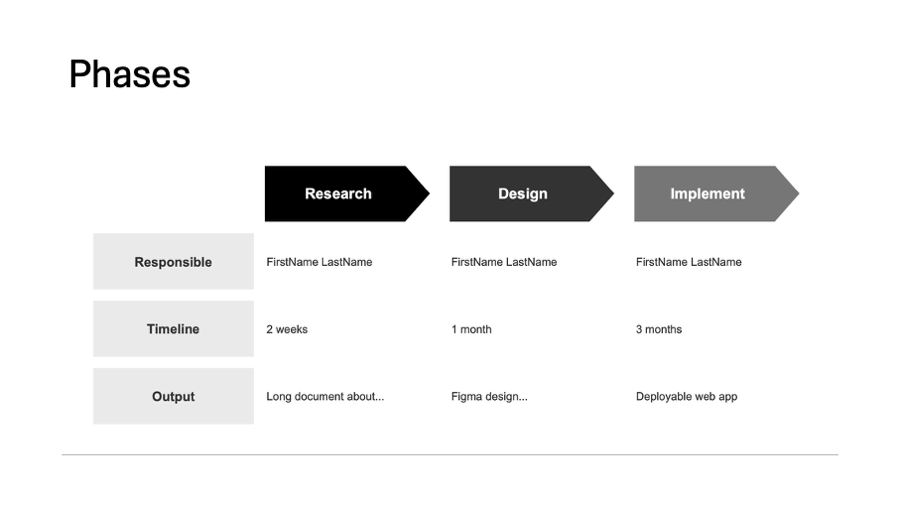
For example, you have a process at hand, step 1 followed by step 2 and then step 3. How do you usually represent it? With the headers starting with the number of the step, don't you?
That requires the consumer to read at least a few headers to understand the pattern.
But we are visual beings, processing shapes is must faster for the mind so you could use shapes to direct the reader's eyes:
- big boxes with arrows on one side pointing to the next steps - easy to scan, contrasted from the normal content;
- small arrows between the headers - if you want something else to be highlighted by contrast on the page, this way the headers are let to blend in to the content, still showing a progression for the mind.
What you should not do, is to use a discreet shape, like a rounded rectangle. These are great for separating dimensions that can be understood stand-alone.
See the pictures for examples of good and bad approaches. What do you think? What are your tricks to communicate with clear visuals? Would you read more of these small tips for slide decks?
Portfolio view
How do you bring complex technical decision to non-technical stakeholders?
It is easier said than done. These following tips will help you get much needed buy-in.
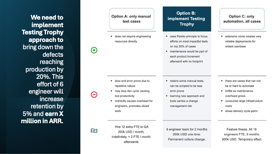
Testing strategies compared with an precise action title: "We implement Testing Trophy to brind down defects in production by 20%. This will cost 6 engineers for 2 months, expecting a 5% increase in retention translating to X million USD in ARR."
Let's discuss a pretty usual yet very consequential decision most CTO/technical leads need to make in any sized company setting: how much do we automate testing from now on?
For this, you bring the portfolio view, where you simplify the decision to be consumable for non-tech experienced colleagues. It is about to get everyone on the same page.
How to communicate it:
- start with the answer,
- paint the options,
- emphasize your answer,
- and connect the reasons to business outcomes.
Always start with the answer, make it interesting for business by connecting it to bottom line directly. This is called the first-day hypothesis and builds credibility, even if changes over time.
Without an initial answer, you may lose credibility or executive presence as in your expert area, you are the main pillar everyone else is relying on. CEO and others can help you debate pro-contra, but won't bring an answer.
Paint your options and support your answer with direct evidence and by doing your homework. Bring good alternatives and show why they were considered and ultimately not suggested to take.
Visually emphasize the answer from the portfolio
- Don't be afraid to show less confidence in options by empty space in pros cell.
- Use background to make an option to stand out clearly.
- Change the shape for the header, even specifically the font size to make it jump out of the page.
- Make the other options to blend in more to the slide background, but retain the structure, it must be clearly a header and its details.
In this scenario, the example reasoning goes:
- Answer (or otherwise, action title): we need to implement Testing Trophy to earn X million ARR.
- Option A: only manual tests, we need to grow our QA department significantly, costing 200k USD / month indefinitely, expecting further growth needed as features grow in complexity.
- Option B: Testing Trophy, uses Pareto-principle to focus on most impactful tests automated, others remain manual for the product teams to handle, costing a one-time 200k USD focus instead product increments (no new headcount needed).
- Option C: everything auto-tested, show the diminishing returns and how large the effort is for a path that overshoots the goal, costing a whopping 900k USD in our fictional company and a quarter year without product features released!
Lot of effort for a slide that may be passed on in 5 seconds in your next board meeting. CEO: "Clear, go ahead with it." This is the case when you did the best pre-work!
Or you may learn that the best option still collides with other priorities. After talking through the page with your peers, you will have a clear reasoning why other option was choosen and clears all misunderstandings later during execution. Of course, only if you send a follow up with the revised option and clear reasoning. Did you do that? 🙂
What execs look for:
- How do we make sure the company flourishes?
- How does this decision contribute to that goal?
- If we implement it, how it changes the bottom line?
- What are the risks of implementing it, versus other options?
At the end of the day, a company is about revenue - cost = profit where profit is ideally above 0.
If ideal, runway increases, stability and new opportunities open up due to growth. If the opposite, profit is negative, than losses mount, options shrink and ultimately the company fails when the line hits the bottom.
And the execs are the ultimately responsible ones for making the calls that result in that line moving up or down.
Outside of the CTO and senior tech leaders, understanding consequences of choosing an architecture or infrastructure to go with is not common. What execs do understand is the potential loss and gains translated to financial language.
Talk the language of opportunity costs and as a tech lead, you can guide them to provide invaluable insights as you navigate the budget and needs at the same time.
Bring multiple options along your recommended route.
Communicate it in a single sentence, the action to be taken with the answer to the "so what?".
"Choosing this architecture fits our hiring plans and allow us to push out features without breaking things." This is only halfway there.
"Going architecture A allows for 2x features by Q3, capturing estimated X USD monthly recurring revenue by upsell."
This you can debate with execs. The finer points of kubernetes and helm? Not so much.
Expect pressure testing your solution though. Prepare and build your case with back of envelope calculations and research. Don't just wing it.
This is my approach to get sponsor/exec/board buy-in to a tech decision. How do you bring such topics to your peers and leaders?
Font sizing
When was the last time you saw a slide with half a dozen font sizes on it? And on the next slide had another 6 different font sizes?
Among other style info like the font family or coloring, the size is a special one.
As the simplest styling, font sizes and their consistency is the easiest to miss in any slide deck. Text size has a large impact on where the reader starts, and what points it follows on the page.
Keeping them concise over the document will communicate care and precision, automatically increasing a bias toward trusting you as a consultant.
The best practice is to keep all normal text to a single size and vary everything else around it, but keep it in check!
In Gridd, we suport 6 text presets for this exact reason, most slides only uses 3-4 in max and all of it has their purpose, beyond how big the font is. A two-level header structure, a highlight and two small body styles should be more than enough for a professional grade deck.
And with Gridd's automation, if you need to change a size, it will be updated on all Gridd's in the deck! Isn't it cool?
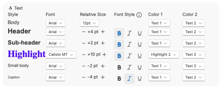 Gridd's stylesheet editor
Icons
The simplest way to become an elegant slide deck creator. Add icons.
We are visual beings. Nice pictures communicate faster and more precisely to us than just text or voice would do on their own.
You can use icons in three ways:
- elegance: a well chosen and styled icon shows care taken, effort put into the slide which in turn makes the reader more receptive to the content;
- replacement: a commonly understood concept can be replaced with an icon which improves clarity and preserves cognitive effort for the reader with less words;
- emphasize: additional icon communicating the same concept strengthens the info and can be useful to establish norms for later on (when not everyone understood the same idea under the same icon).
How do you use icons on your slide decks? What cases it backfired to have them on the page?